As an addition to the Sunny Jim labels, it was a pleasure to digitally redraw the fruit illustrations for the front of each label for each flavor.
Based solely off a whimsical drawing created by Sam’s daughter, I was asked to create a brand for Sam’s Ginger Beer. The ginger beer was produced locally here in Oregon in small batches. The line included 5 fun flavors, perfect for all ages.
To aid our sales team, I was tasked with designing a set of print postcards for each of our major city publications to promote our Fall 2024 issues. These postcards were to be sent out to potential advertising clients to get them excited about being a part of the next print issue.
Shown here are the final approved versions, as well as some of my other favorite drafts from the project.
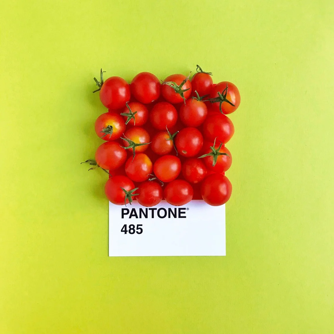
Although putting objects on Pantone swatches isn't a new concept, I give my own spin by hunting for organic hues that jive with the universal system for color. I enjoy the artistic challenge of making the food one with the swatch, both in color and shape. You can find all of the posts in the series under #laurenlovespantone on Instagram.
SagaCity Media clients are invited to be a part of special advertising sections, that highlight their business or non-profit in a profile style print-ad. These profile sections highlight a group of advertisers together, making a stronger visual impact.
Shown here are profiles from Sarasota Magazine’s special sections including:
Glow Up, a feature for wellness spas and beauty treatment centers.
Roost, showcasing local realtors and their current home listings.
Tastemakers, promoting neighborhood restaurants and their owners or chefs.
Women of Influence, highlighting women and their businesses in the Sarasota area.
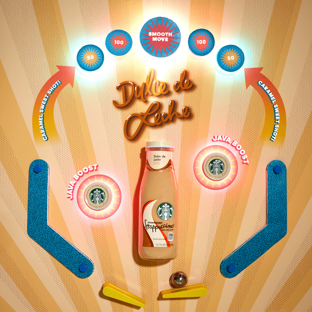
Under the art + creative direction of Amy Untch, and Tian Muholland at Swift, I was able to help out on the Starbucks account retouching images, making gifs for social, as well as utilizing my illustration skills for concepting and final artwork.
. . . .
For the ready-to-drink oddly satisfying series, I helped bring creative concepts to life under the direction of Heather Apple and Erin Stevens. As shown here are my mocked up illustrations alongside their final counterpart.
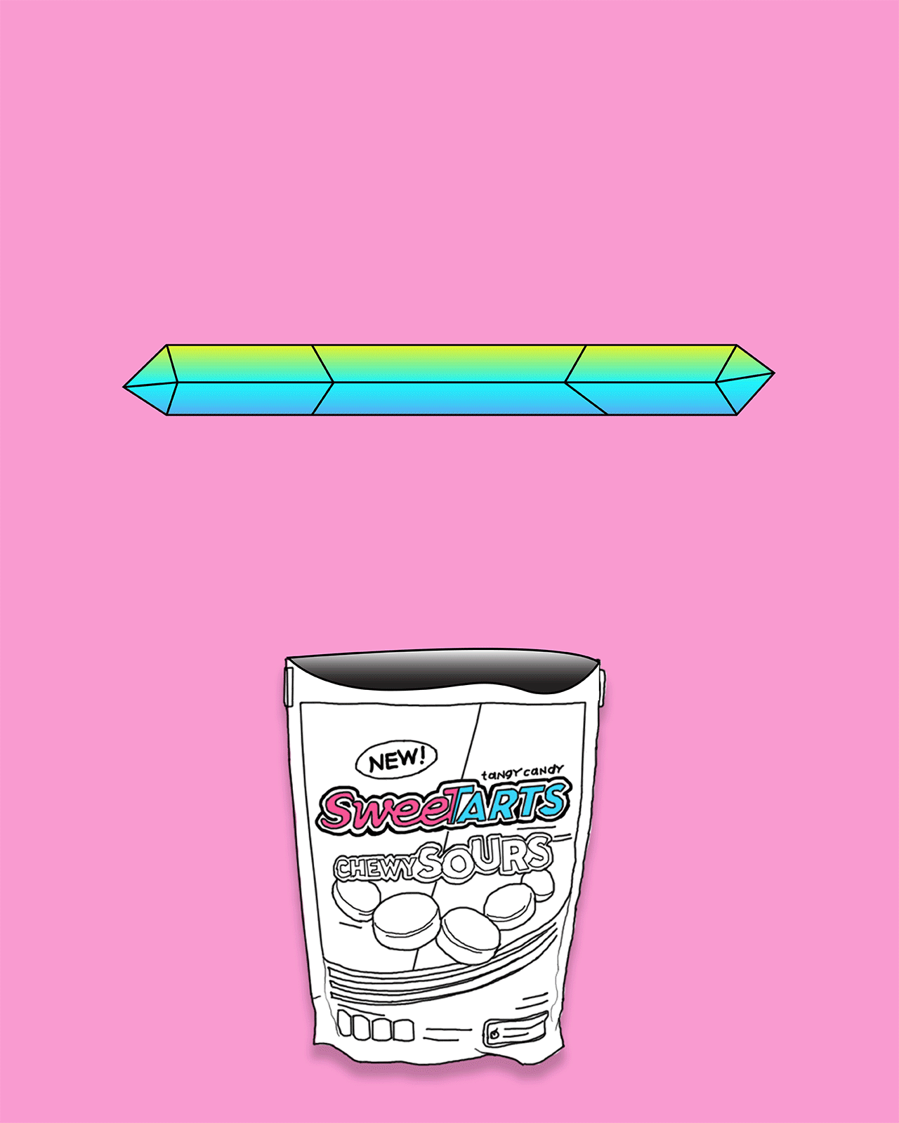
While working at Swift I was tasked with bringing social concepts to life, so that our clients could imagine what the posts would eventually look like when they are shot in front of a camera for real. Under the creative direction of James Robinson I was able to convey the Sweetarts brand within each sketch, showcasing the bright candy and it’s various fruit flavors.
Basics Market, underneath the Wild Rose Foods company umbrella, is a locally owned chain of grocery stores focused on nurturing strong, healthy communities through food.
Within a year of working for Basics Market I was given the opportunity to try my hand at food photography for the market’s Recipe Cards. I was already formatting the cards themselves, but was now able to style and shoot the image that would complete each card.
This project is an addition to the work I have done for the Memorial Union Graphic Design Studio at Oregon State.
DAM JAM is the annual spring concert at the end of the academic year at Oregon State. Hosted and run by the OSU Program Council, a student run group on campus. Since it is the largest attended event of the year, I felt lucky to be able to design just about every item for the entire event.
Along with printed materials and merch, the website was once a fully illustrated and animated landing page as seen here! As an added bonus, I created a banana pattern as Amine’s meet and greet backdrop.
Under the Wild Rose Foods umbrella of brands, many product lines needed label and packaging updates as each brand was expanding to include new merchandise. For all of the products shown, I was provided baseline branding elements to get started thanks to our friends at Maxwell and I developed the rest of the labels from there.
A pacific northwest brand that had been waiting for it’s moment to come back to the spotlight, Sunny Jim brings to the table a wholesome feel with a clean list of ingredients.
Bringing a vintage brand back to life is no small feat, but by rebuilding the original logo, scanning old images of our boy Jim, and redrawing each fruit illustration, the brand comes together as if it had never left the shelf.
Basics Market, underneath the Wild Rose Foods company umbrella, is a locally owned chain of grocery stores focused on nurturing strong, healthy communities through food.
As a designer for Basics, I have been able to have my hand in a number of projects throughout years, including the introduction of an ever evolving “In The Market Now” Flyer, which features great items for a great value. Shown here is how it was first implemented in stores, but has now grown to include over 20+ products to showcase our growing selection.
While in college I was a part of the group of designers who worked for the Memorial Union in Studio 204. We focused mainly on projects for other student organizations doing event promotion, but occasionally did work for University Housing and Dining. Each designer had their own set of clients and worked with them on each project from start to finish.
Working on campus as a graphic designer at Studio 204 taught me a lot about the importance of communication, handling multiple projects at once, and time management. Working for students was both rewarding and difficult, but rewarding more than anything. All of the examples shown here were done for a student organization on campus for a particular event or for University Housing and Dining at Oregon State University.
A brand under the Wild Rose Foods umbrella, Willamette Valley Cheese is artisan organic cow’s milk cheese brand, hand-crafted in the traditional European style.
When Willamette Valley Cheese was acquired by Wild Rose Foods, it was in need of a brand refresh. I was tasked to update the labels to a more elevated and clean look, with a clear cohesive design amongst all the different cheese types.
Pictured here are an example of the old labels and how the new ones turned out in multiple instances.
My senior thesis project was called: Arbejdsglaede, or rather it's pronounciation "ah-bice-gluhe."
It is a Danish word that literally translates to: “work happiness”. In other words, it’s a simple way to say that you love what you do in your career.
I believe in doing what you love, and finding happiness in your everyday work. My project was about helping students in the creative arts field learn and discover how to do just that. Art education is important, and has proven to be beneficial to every student, as well as having an effect on their performance in other subjects. Many students don’t have the opportunity to create art in schools, or realize they have a talent for it because of the lack of support. My arts education was so important to my path and success in school, that I needed to create something that could help other students discover what I did.
I created a set of folders that could easily be implemented into schools, depending on level of education in consideration with the amount of resources available in each classroom. Each folder example teaches the basics of patterns, which includes a step by step walk-through and an artist feature that highlights how someone is using this art form as their career.
Each folder is in black and white and printed on a material that allows for a student to color it in however they wish. Though my examples only highlight making patterns, the idea is that these folders could be modified for many different subjects, such as: photography, painting, ceramics, logo design, embroidery, and so on.
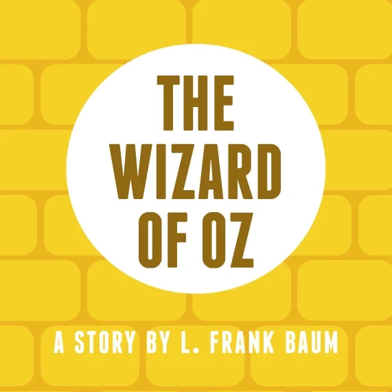
In my first year of the Graphic Design Program at Oregon State, we were asked to make a series of 3 cohesive book covers. The stories were to be found on the Project Gutenburg site, which contains hundreds of downloadable books free to the public.
I chose to do 6 book covers, to extend my series and system further. For each, I included a pattern or illustration and kept them all very kid friendly, in the hopes that young readers would be drawn to these timeless classics.